Ellie House GCSE Photography
Current Grade : C
Target Grade : A
date : 6.01.17
Target Grade : A
date : 6.01.17
Unit 2 Exam
Architecture
Architecture Margaret Stratton's photographs are often based on how an image might tell a story about the use of a building in the past. Candida Hofer produces a series of detailed photographs of the interior of public buildings and have similar functions, such as museums and libraries. Berenice Abbott and Ezra Steller were interested in the building materials and scale of Urban architecture. Research appropriate sources and produce your own work inspired by architecture.
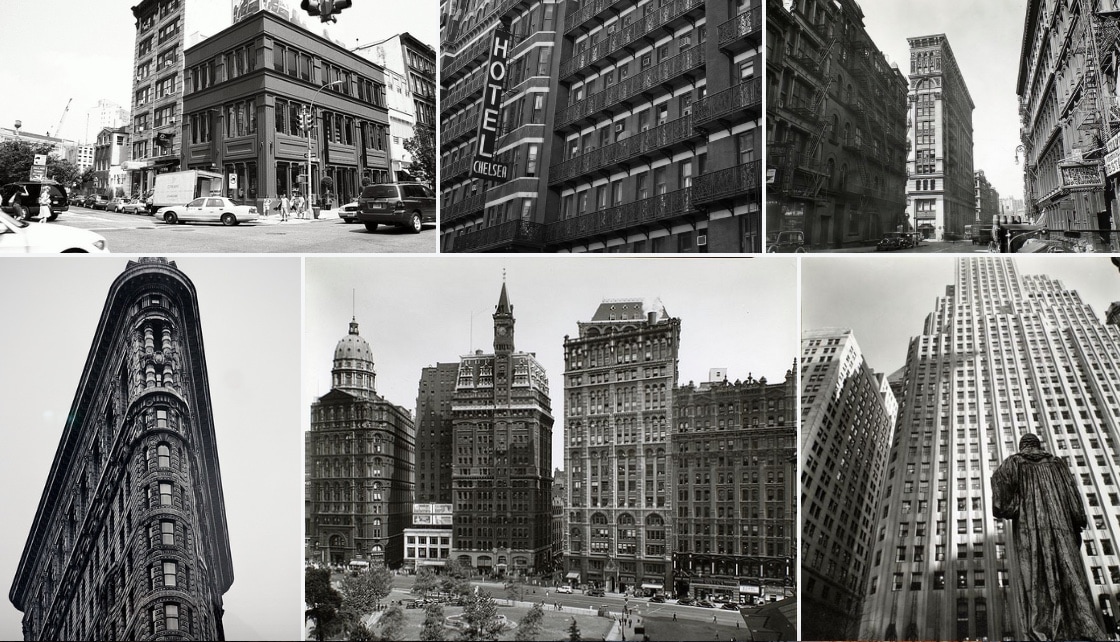
Berenice Abbott
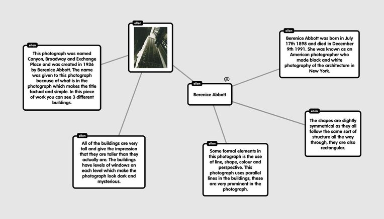
Berenice Abbott was born in July 17th 1898 and died in December 9th 1991. She was known as an American photographer who made black and white photography of the architecture in New York. At University she studied Theatre and Sculpture which made her spend 2 years studying sculpture in Berlin and Paris. Berenice Abbott's photographs included photographs of Pike Street, Henry Street, Manhattan Bridge and Financial District rooftops.
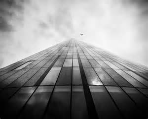
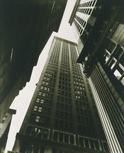
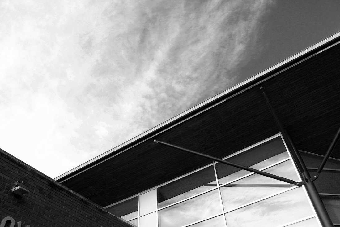
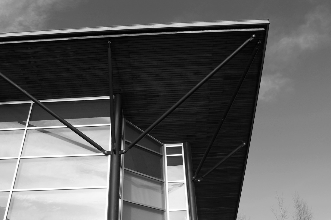
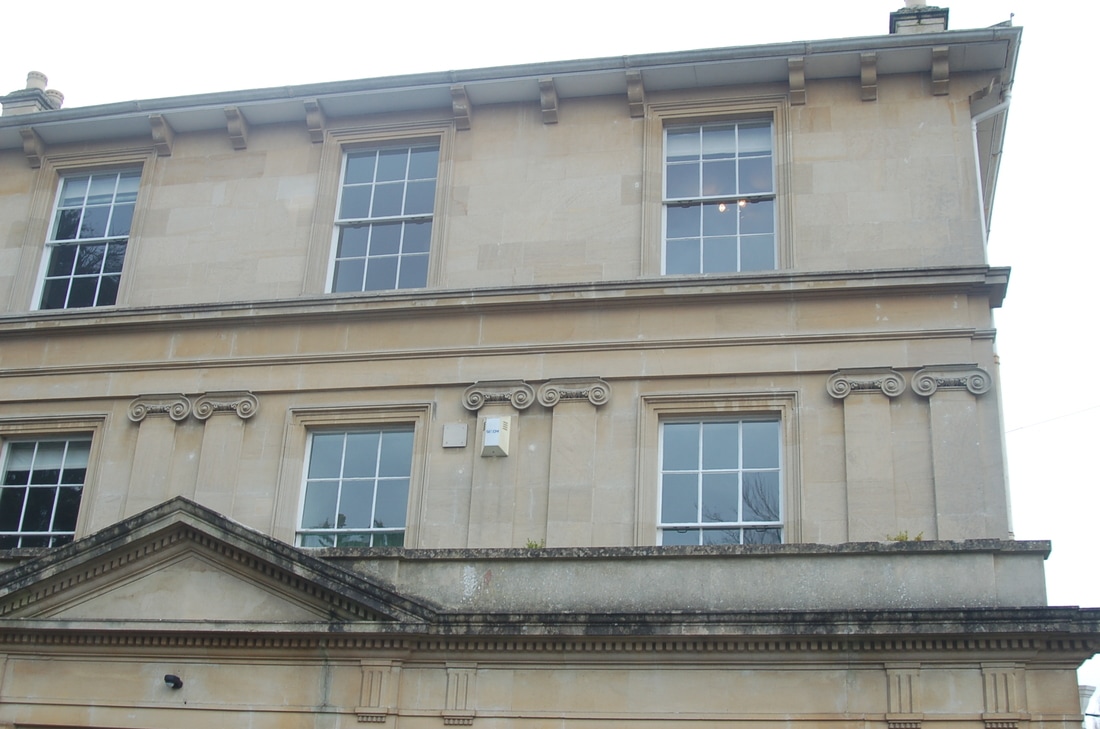
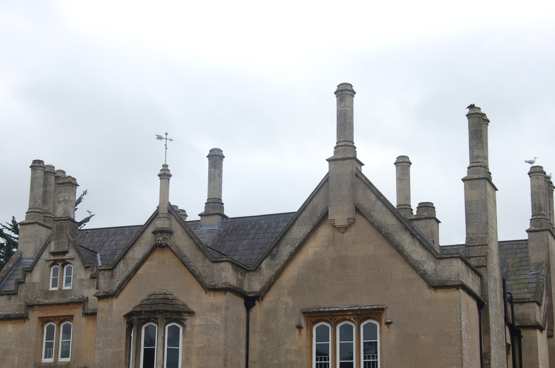
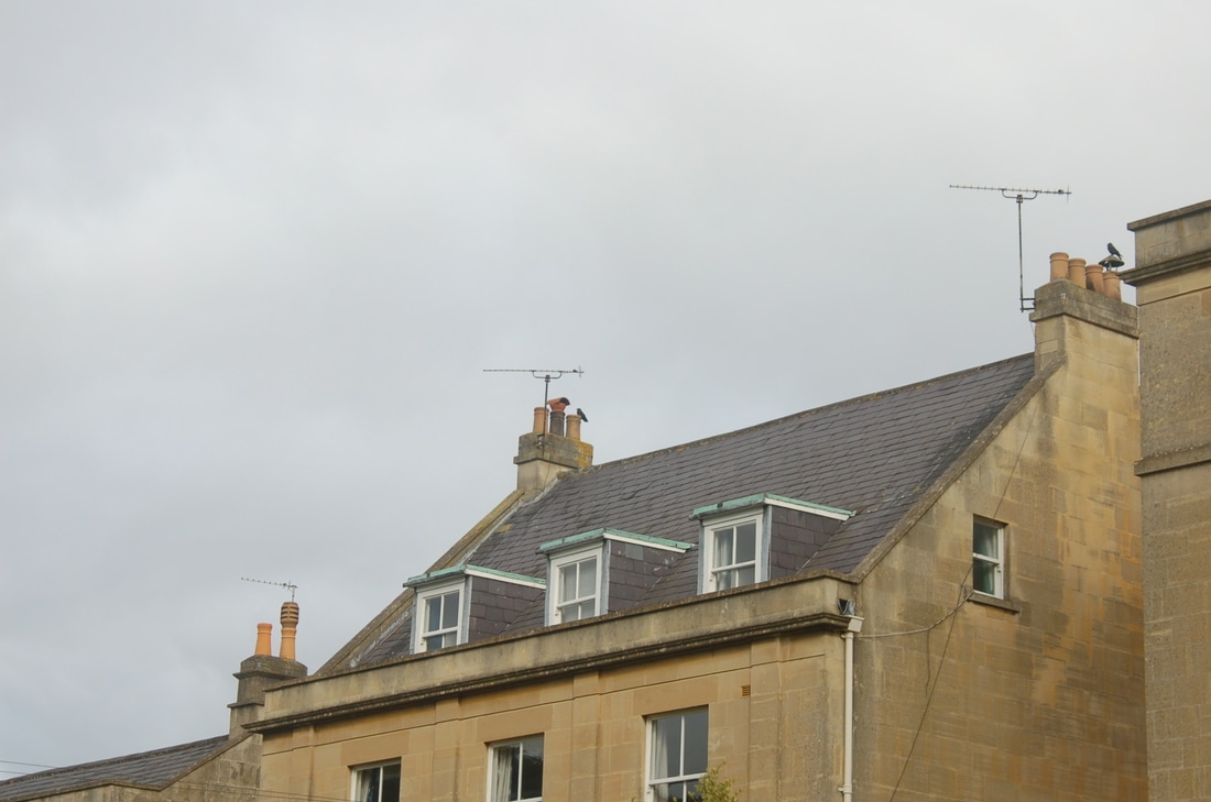
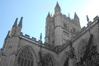
This photograph was named Canyon, Broadway and Exchange Place and was created in 1936 by Berenice Abbott. The name was given to this photograph because of what is in the photograph which makes the title factual and simple. In this piece of work you can see 3 different buildings. All of the buildings are very tall and give the impression that they are taller than they actually are. Berenice Abbott takes her photographs looking upwards at the buildings instead of central which gives the impression that the buildings are endless and reach the sky. The buildings have levels of windows which make the photograph look dark and mysterious. Due to the photograph being taken upwards no people can be seen, which also leads to a sense of mystery to many people as they are intrigued at the sort of atmosphere of the roads and what it may look like. I think this is interesting as the buildings make it feel like quite a miserable and bleak and atmosphere however in reality that could be very different as you cannot see the whole picture. The old fashioned black and white colour also makes the sky look cloudy. The photograph was retaken in 1997 after Berenice Abbott's death in 1991 to recapture the photograph and show the difference in New York from the time she took it. The fact that the Photograph is taken with the viewpoint looking upwards, this could signify how she felt at the time, feeling positive and looking upwards to the sky. I also Find it interesting how she allowed some of the buildings to overlap one another in the photograph, this is because she wanted the photograph to look as natural as possible. Some formal elements in this photograph is the use of line, shape, colour and perspective. This photograph uses parallel lines in the buildings, these are very prominent in the photograph. They are long and also thick, they are prominent to distinguish the sky from the buildings. Another formal element shown in this photograph is shape, this is obvious as the buildings create shape. The shapes are slightly symmetrical as they all follow the same sort of structure all the way through, they are also rectangular. I feel as though this makes the photograph look more busy. Also the colour, is black and white although has a brown colour within it, I think this makes the photograph look older. The perspective is one point, as it is looking upwards instead of central making the buildings look much taller than they are.
From this photograph I would like to take a few ideas and add it into my own work. I would like my work to look similar to hers with the perspective she is looking at the building from. To do this I will attempt to take my photographs looking upwards as well just as she did. I will do this by pointing my camera upwards and trying to get as low to the ground as possible to be in the best position to get the whole building in the photograph. I will also make my photographs black and white after I have taken them so that it shows I am creating my photographs inspired by Berenice Abbott. I will also try and create the shadowing effect she incorporates into her work to create that mysterious atmosphere that she was trying to capture in her work.
From this photograph I would like to take a few ideas and add it into my own work. I would like my work to look similar to hers with the perspective she is looking at the building from. To do this I will attempt to take my photographs looking upwards as well just as she did. I will do this by pointing my camera upwards and trying to get as low to the ground as possible to be in the best position to get the whole building in the photograph. I will also make my photographs black and white after I have taken them so that it shows I am creating my photographs inspired by Berenice Abbott. I will also try and create the shadowing effect she incorporates into her work to create that mysterious atmosphere that she was trying to capture in her work.
Shoot 1 : Buildings
Shoot 1 plan : My plan for shoot one is too investigate with buildings and to develop an understanding about what photographs best reflect the work of Berenice Abbott. To do this I will walk around school and look at different buildings and the structure of them. I am interested to look at the different types of photographs I can take with the same building. For example the different angles in the building. I will look at taking the photographs upwards and from the side at different levels. The light involved may have an effect on the photograph as a whole as it may cause reflections in windows, also if it is dark it could make the photographs look bleak and upsetting when that is not the intention. While taking this photograph there are questions I need to ask myself to make it as good as possible. For example am I close enough to the photograph? This is important because if I am too far away then I cannot show any description or details in my photograph. Also What do I want the main focus in my photograph to be? Well the main focus should be the buildings in the photographs and the structure should be shown as well. After I have taken the photographs, I will choose the photographs which I feel best suits that of Berenice Abbott and her photographs. I feel that I may find it difficult as it is my first shoot to get the angles of the photograph correct so that it reflects my critical analysis of my main photographer. This may be a set back as it may make the photograph look very different to how I want it to be. Also the light intensity may be irregular as my only source of light I will be using in my photographs is natural light so may be difficult to create the right light intensities in my work.

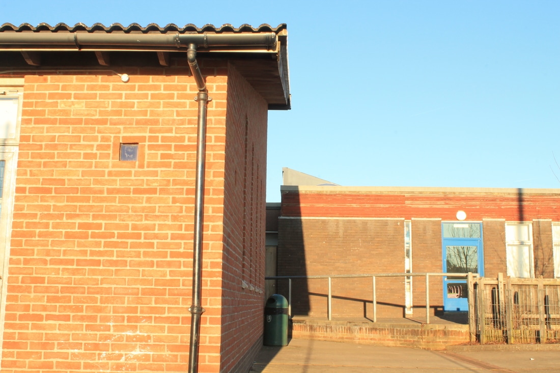
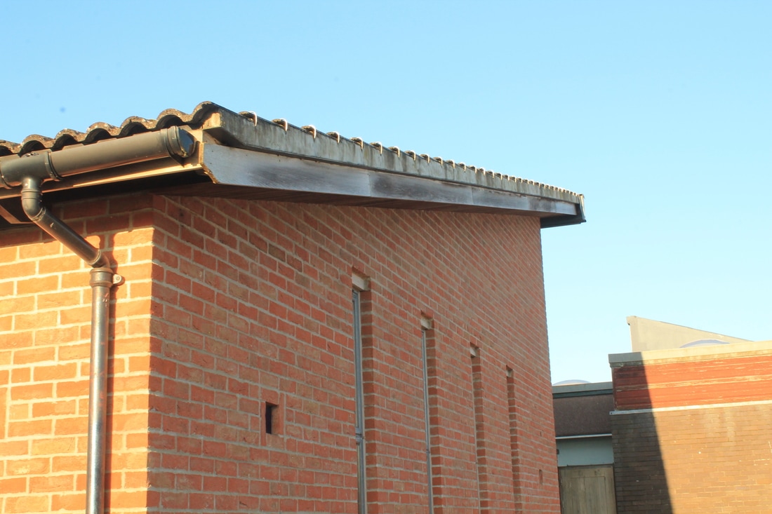
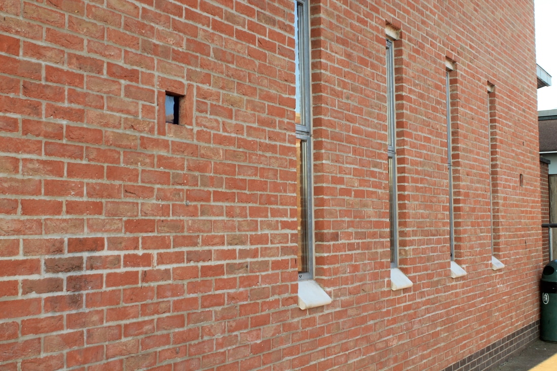
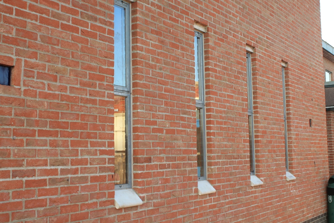
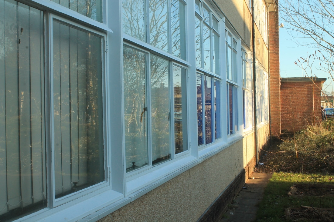
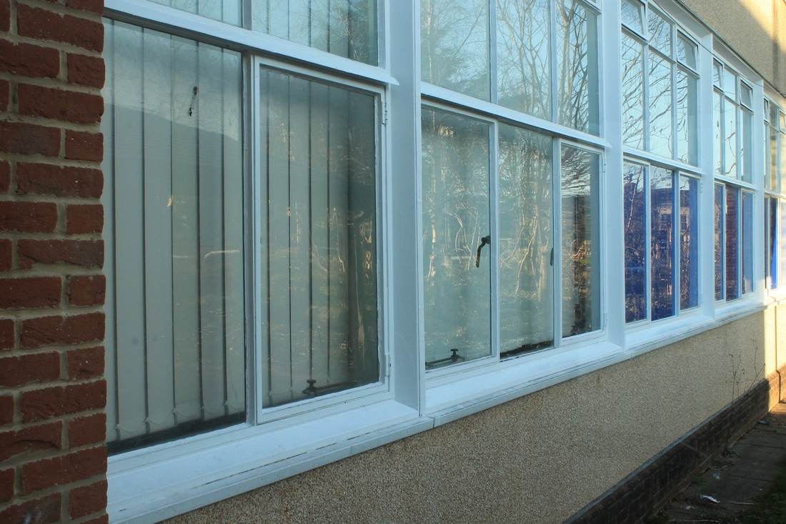
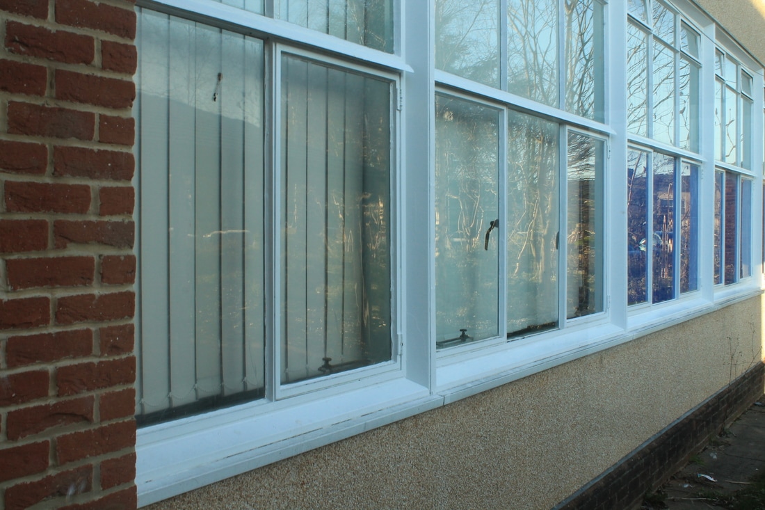
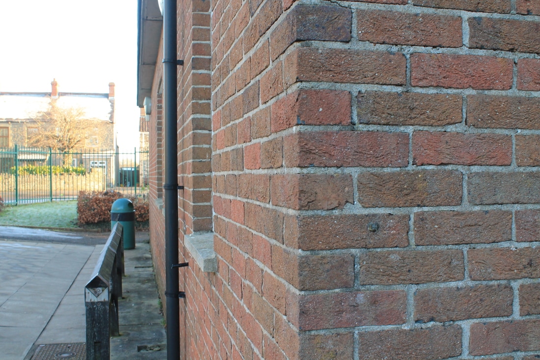
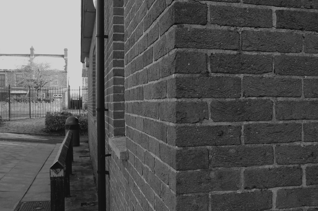
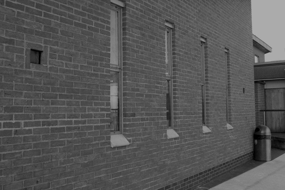
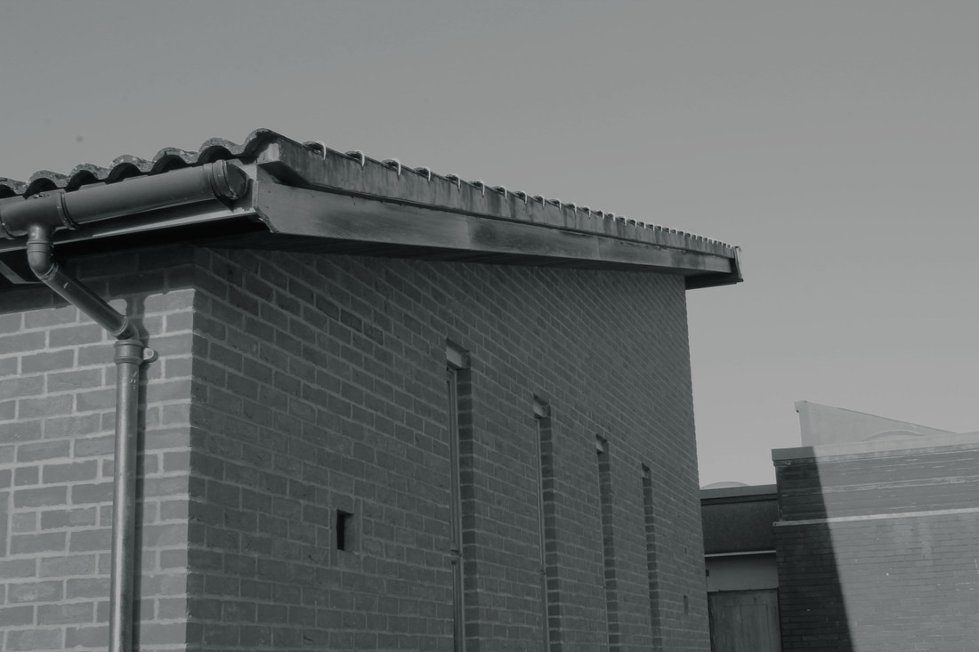
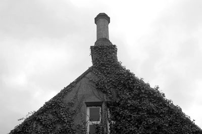
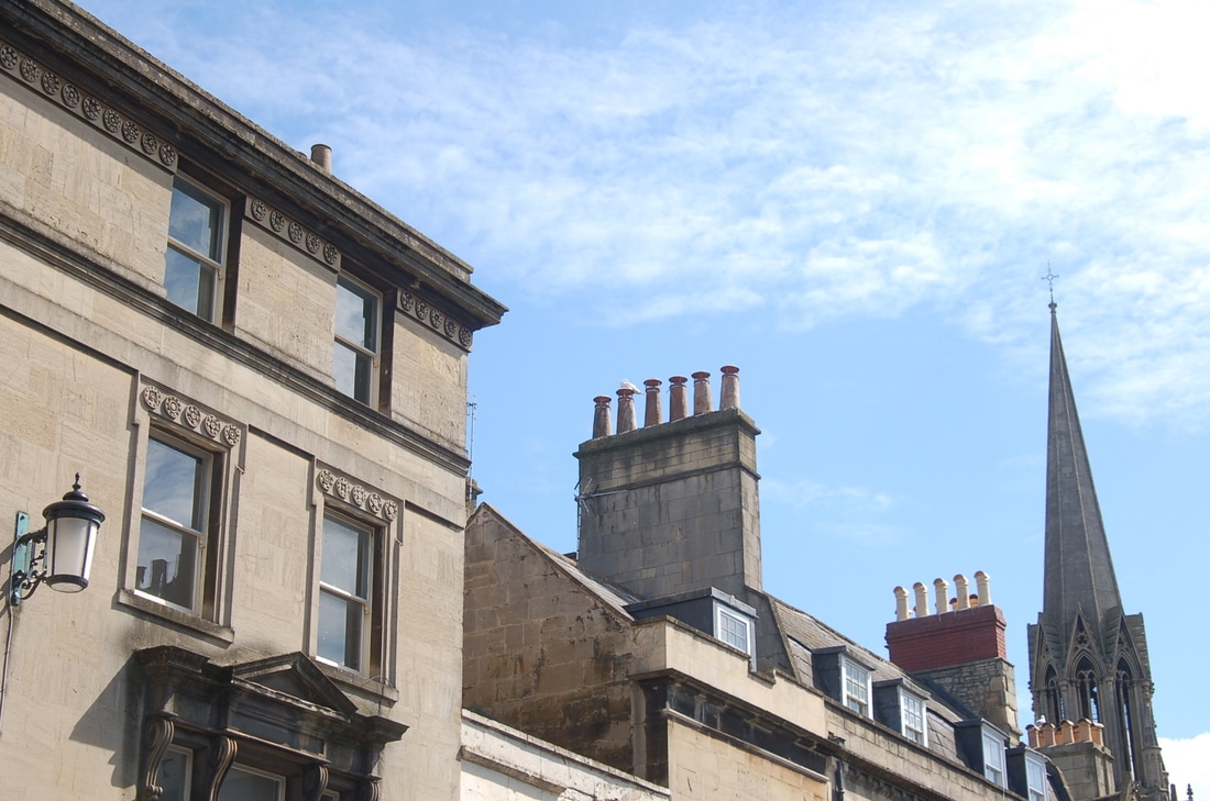
These are the first set of photographs I took based on the idea of architecture. For these photographs I decided not to make a firm plan on the places and sort of photographs I would take for shoot 1. Instead I decided to look at the possibilities on the different kind of shoots possible and the next steps I could take from taking these photographs to decide what I need to do next. When I was walking round school I found some interesting architectural buildings that could become a good photograph. I looked and also experimented with different angles while taking the photographs so that I could look back on what angles suited the building the most. For many I took a side view of the photograph as I felt this gave a nice effect of the building looking longer and bigger than it actually is, a lot like the photograph Berenice Abbott took which I critically analysed. The photograph I liked best in this shoot is the building I took looking upwards. I liked this as it made the building look a lot larger than it was as it was taken from an irregular perspective. I also liked the shadowy effect that hits the building from the sun as this becomes especially prominent in black and white. The photographs I like less are the straight forward photographs which are looking straight at the building. I like this less as it gives no depth to the photograph and is not interesting to look at. There were some formal elements in my work. for example lines and shape. In many of these photographs the shape is elongated to make it look a lot larger or longer than it is. The black and white photographs also create a hard and perhaps dramatic tone. I think these photographs I have taken create a gloomy and dreary atmosphere for the audience as it is quite a dark light. I decided to make my first 7 practice photographs black and white so that it fit more with my theme and made it clearer to tell that all the photographs were inspired by Berenice Abbott. I used the auto contrast tool on Photoshop which I feel made the darker parts of the buildings for example: pipes on the roof a lot darker which made them stand out a lot more. I also did this so that it related more to my photographer as the buildings she took were also very dark. I think the middle bottom photograph looks most like the photograph I critically analysed from Berenice Abbott's photographs. For my next steps in the next shoot, I would like to carry on my idea of photographs Inspired by my photographer Berenice Abbott however I would like to make it a lot more liker work. I will do this by taking my photographs looking upwards and creating much more of a dark and shadowy effect.
shoot 2 School Shoot
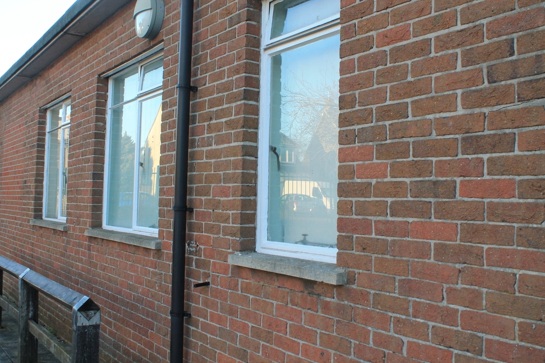
For this shoot I plan to make it look a lot more like something from Berenice Abbott's work. I feel my last shoot was not something from Berenice Abbott's work and I found it hard to link similarities from my work to hers. I think my first shoot was a practice shoot to see what photographs work well and don't work as well so I knew how to change this for my first proper shoot. As last time I will be doing this shoot in school. I think this is a good place to start of my shoot because even though it is not the place I want to be taking my photographs later on in this project, it is a good starting place. This is due to the amount of places I am able to take the photographs due to it being a school. My plan for this shoot is to attempt the looking up type of photograph that Berenice Abbott does. This is where she takes the photograph low down looking up, making the effect of buildings looking much taller than they are. I will also be making these photographs into black and white to also fit the theme of Berenice Abbott. When I turn the photographs black and white I will also be creating darker parts to the building to make it have a mysterious, depressing and bleak looking atmosphere. There are places within school that I think will look interesting on camera or captured in a photograph. For example the reception area in school outside already has a dark colour to it which would make it a lot easier to darken the atmosphere and create shadows in the work.
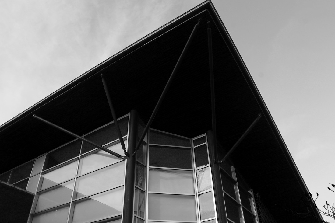
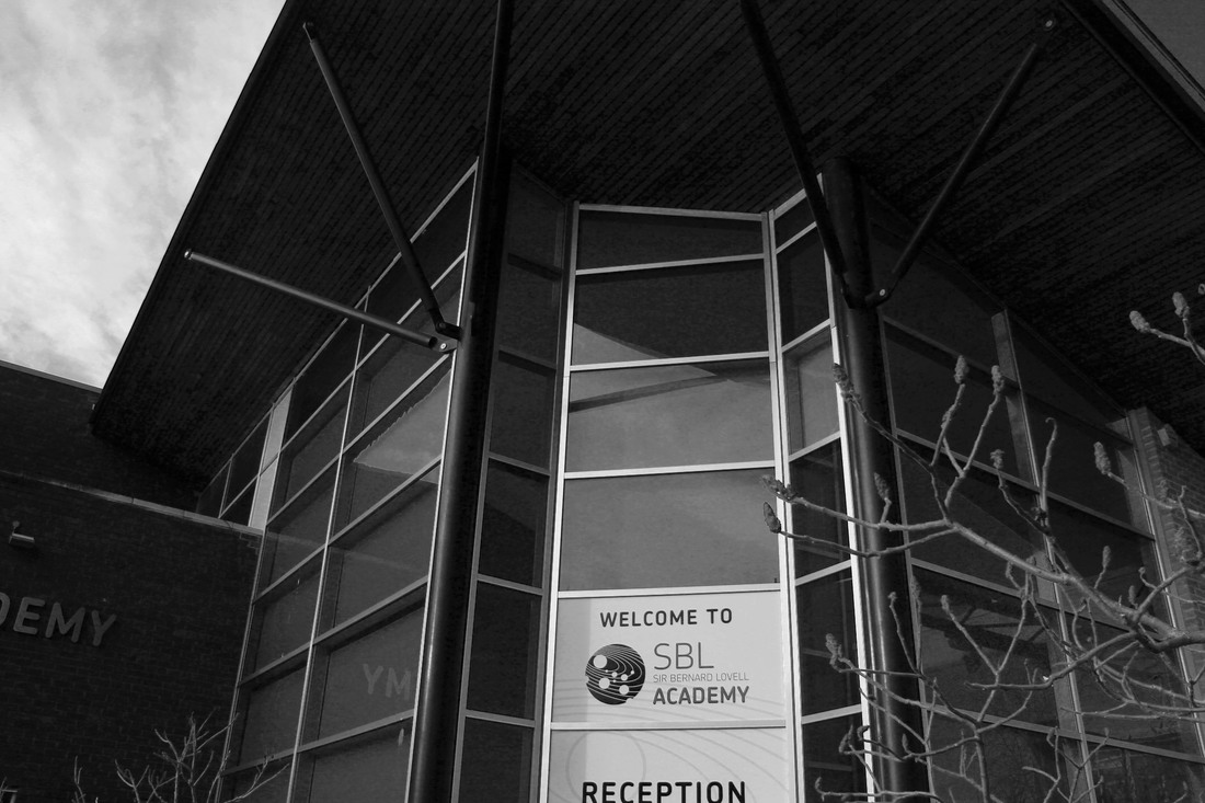
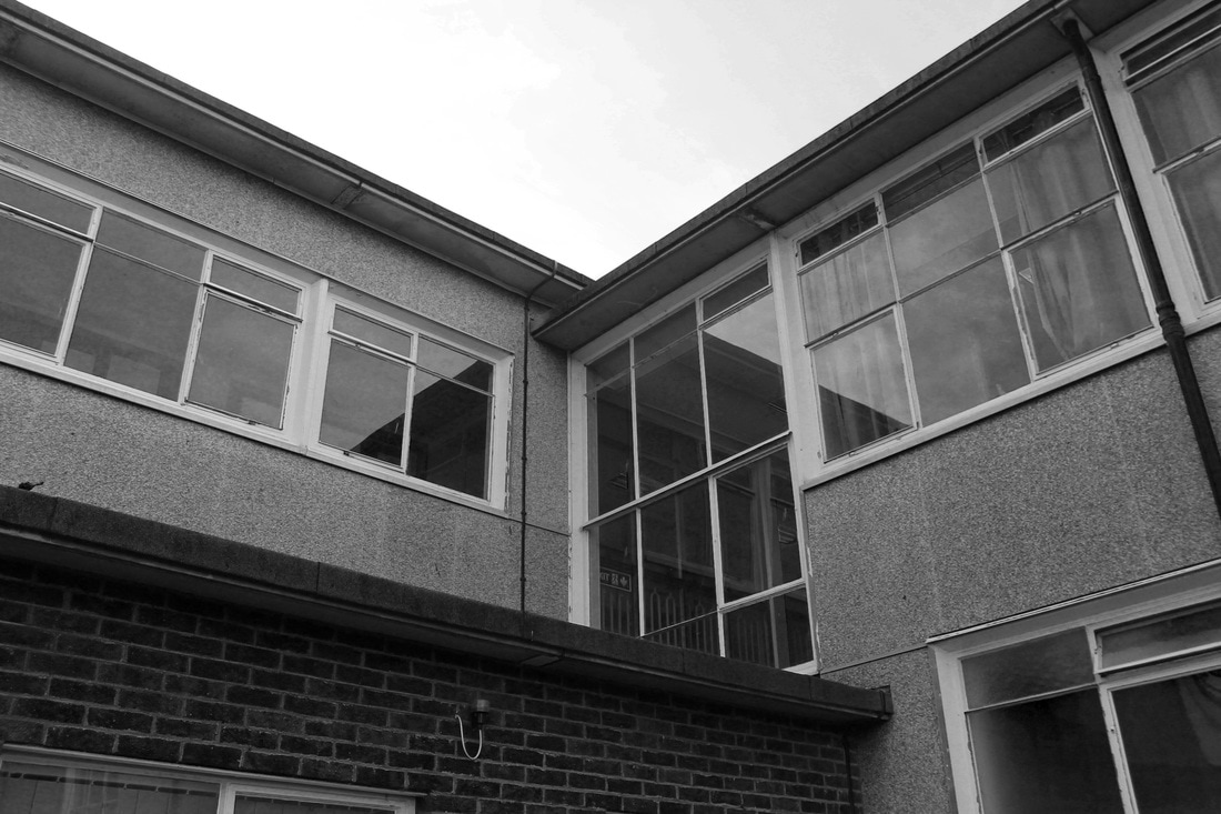
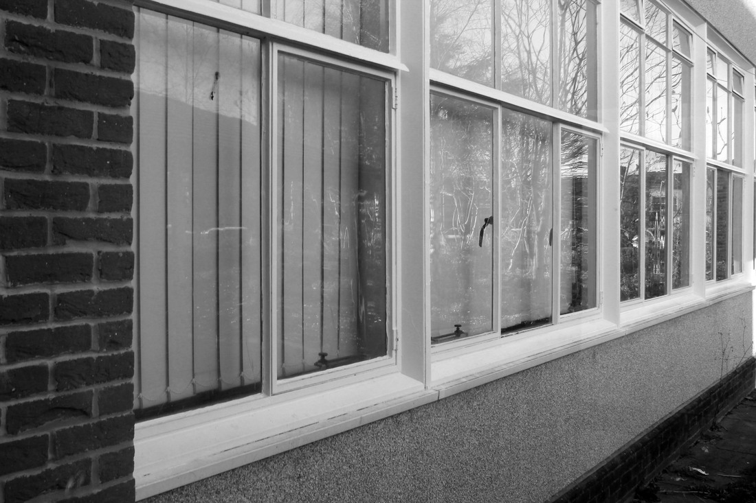
This is my second shoot for my unit 2 exam. For this shoot I wanted to focus more about looking up at the photographs instead of it being central to the building. I wanted it to be like this so it is recreating more the photograph I am trying to show with Berenice Abbott. To do this I tried hard to make sure the photos were pointing upwards on many of them. I spent some time taking photographs of the outside entrance for the school reception. I liked taking photographs in this place as there were details I could show easily. For example the top left interested me due to the windows. The shadowed effect on the windows is much like the shadowing in many of Berenice Abbott's work. I also liked how when I took photographs of the reception there was a range of lighting intensities which can be especially shown in black and white. The low light of the inside ceiling contrasts with the lighter windows. I feel as though this shoot is better than my first shoot however I would still like to replicate this sort of style of photograph again in Bath.
Bath Plan for Shoot
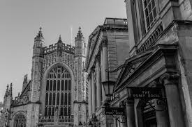
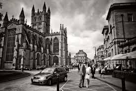
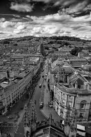
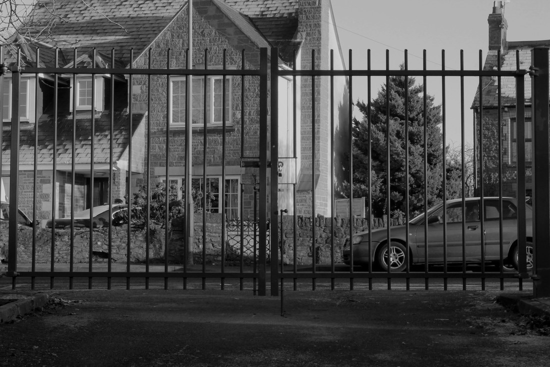
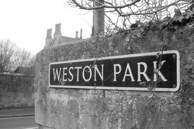
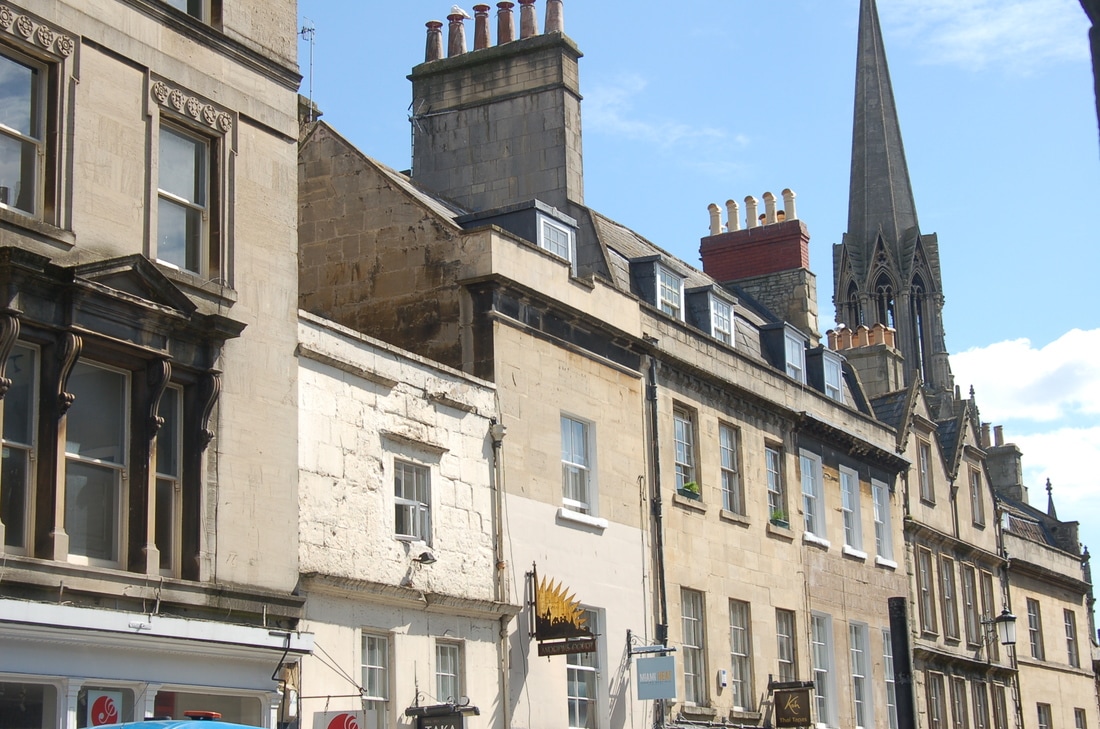
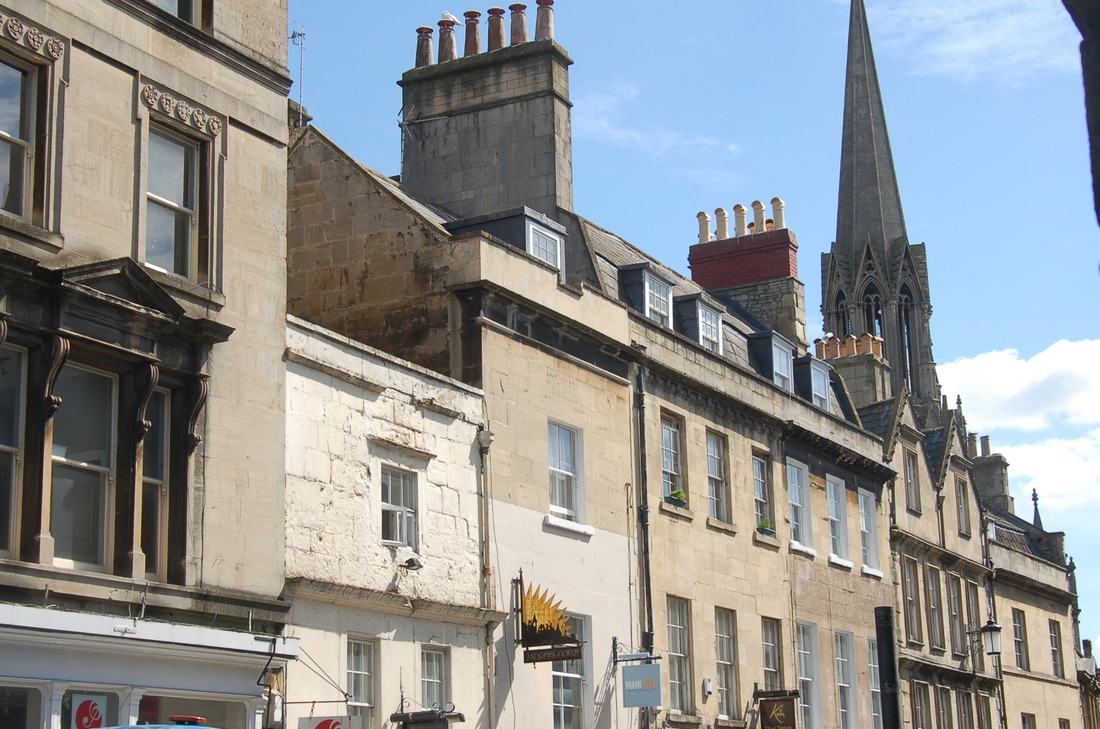
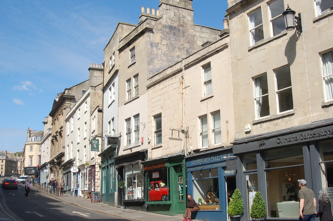
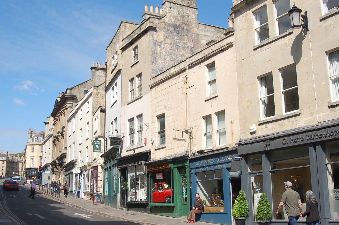
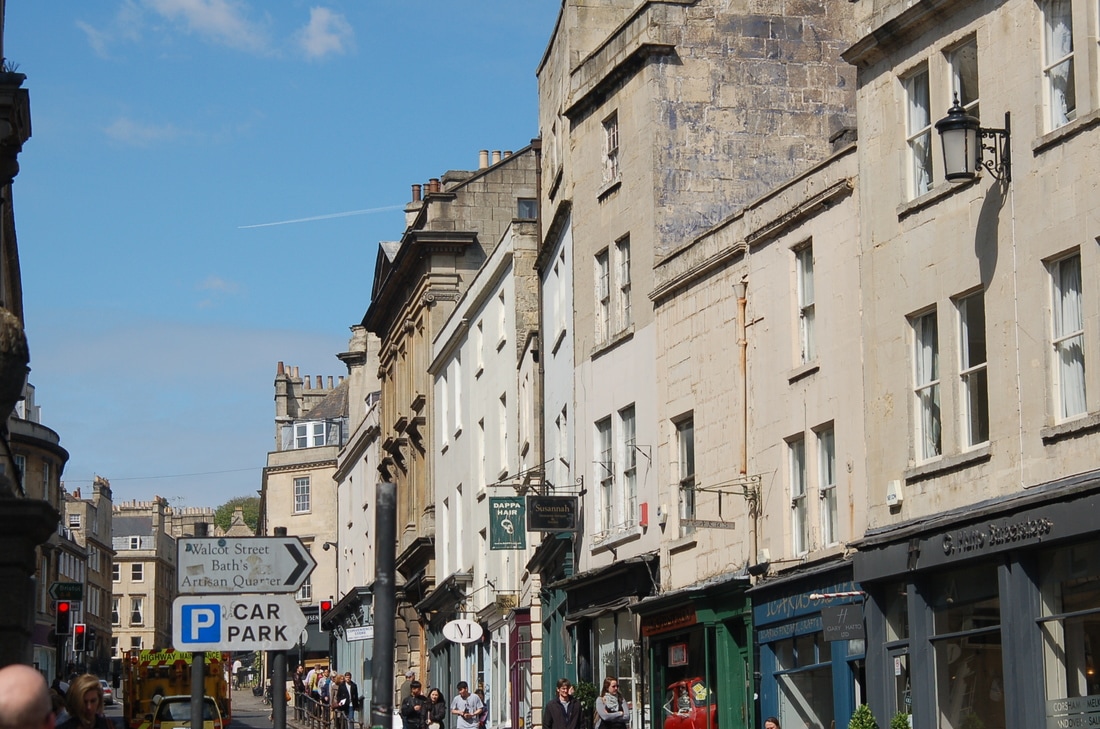
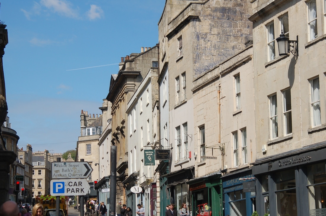
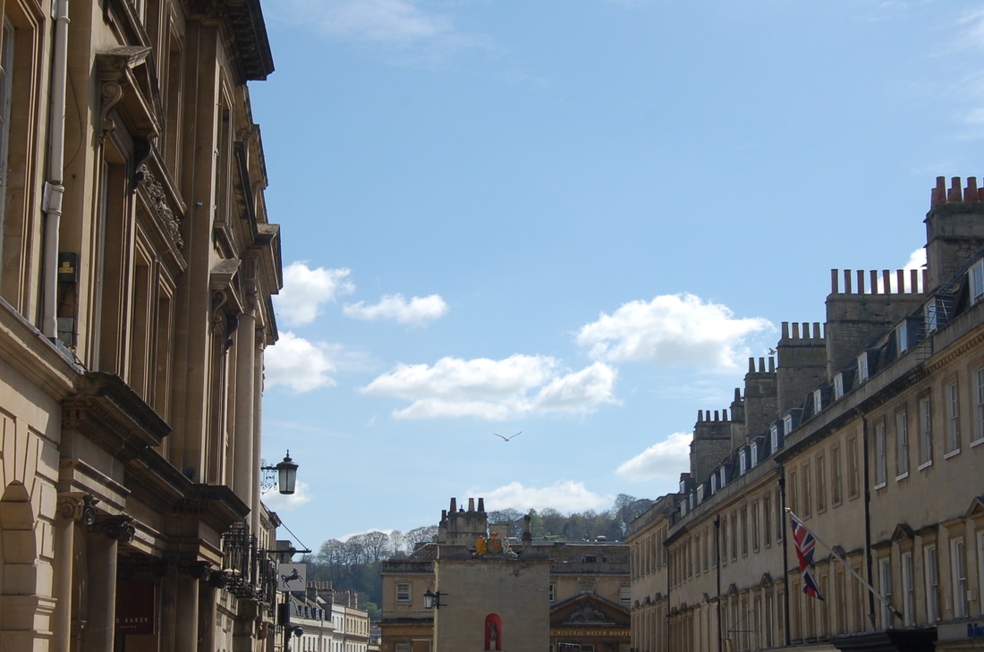
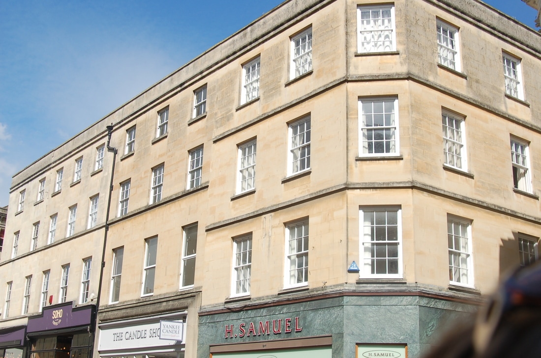
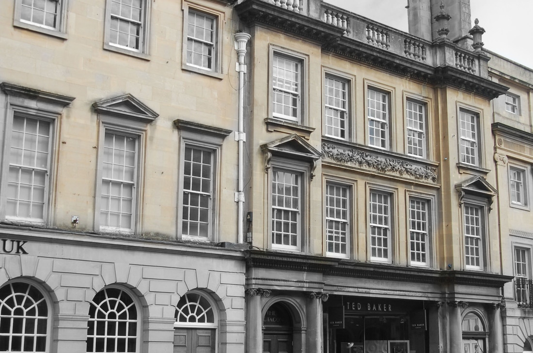
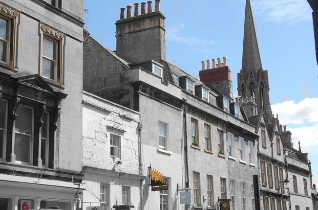
Bath is a great place for taking photographs of architecture due its big buildings and old places. My main place for my photographs are Bath which is where my photographs will mainly be placed. Above are photographs taken by others in Bath while they were there. I decided to pick the photographs taken by people that were black and white in order to show that I am still taking my photographs the same as Berenice Abbott. I chose Bath as my photography place of choice because it is very busy and big and the buildings there look a lot like the buildings that Berenice Abbott took in her work.
The sub theme I have chosen is old buildings, I intend to investigate Bath to help pin-point my idea. In this work I will be using black and white colour and i will also be going into Bath to develop my work. The context of my work is based on firstly the artist Berenice Abbott. I was influenced by her work use of black and white and eye point the photographs are taken. my ideas were inspired by the type of buildings she took which appeared modern and old. The main formal elements I am interested in exploring further are colour and shape and line. I have been inspired to use these formal elements because it is what I noticed Berenice abbot using when I first looked at her work. I want to create a negative atmosphere. I want to do this as the buildings are old and it could show what the buildings have been through.
The sub theme I have chosen is old buildings, I intend to investigate Bath to help pin-point my idea. In this work I will be using black and white colour and i will also be going into Bath to develop my work. The context of my work is based on firstly the artist Berenice Abbott. I was influenced by her work use of black and white and eye point the photographs are taken. my ideas were inspired by the type of buildings she took which appeared modern and old. The main formal elements I am interested in exploring further are colour and shape and line. I have been inspired to use these formal elements because it is what I noticed Berenice abbot using when I first looked at her work. I want to create a negative atmosphere. I want to do this as the buildings are old and it could show what the buildings have been through.
Shoot 1
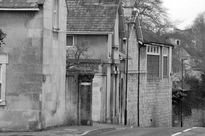
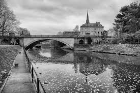
For this shoot I was unable to get properly into Bath so decided to take these photographs in Weston (on the outskirts of Bath). For these photographs I wanted to make an array of separate photographs before I went properly into Bath. I like these photographs a lot as I think the gloomy weather helped to emphasize a sense of sadness or mystery in the photograph. The buildings I took a photograph were also quite old and mundane. I experimented with different types of buildings, eg : the side or the top of buildings. I also got into the middle of the road for one of the photographs and took a photograph of a row of buildings. I really liked this photograph as you can really see the definitions of the start of one building and the end of another which really interested me. To improve on my work next time I really need to focus on taking one aspect of the photograph and try and make it as prominent as I can so that it really stands out.
Shoot 2
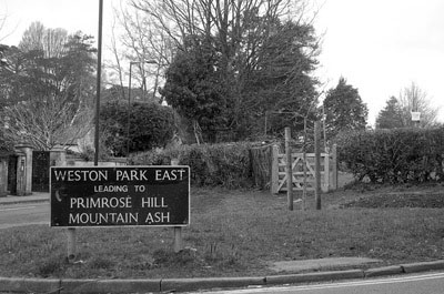
These photographs were taken in The Cotswold's. The two top middle photographs were taken in a style to try and add a sign with the building behind it. This is the idea I have come up with for future shoots and hopefully for my final shoot inspired by the two photographers. This idea theme is to find sign which would make the photographs interesting and then showing the building which represents the meaning of the sign behind it. For example in the two middle top, to improve I would get down lower in the photograph so that the sign is closer to the camera and then have the camera looking upwards to a clear picture of the building. Although I will not be able to goo back and have another go and taking a better photograph of that particular building, I hope to try again with photographs In Bath which is my photograph city I have chosen.
Second Photographer

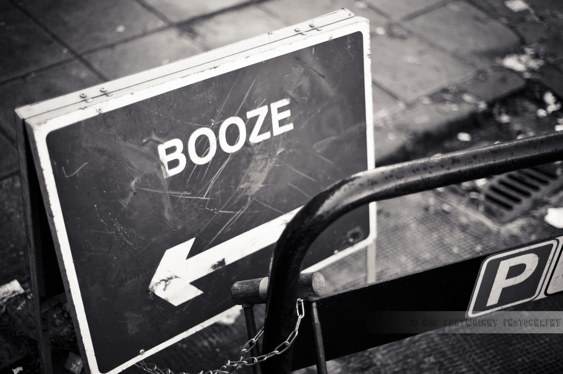
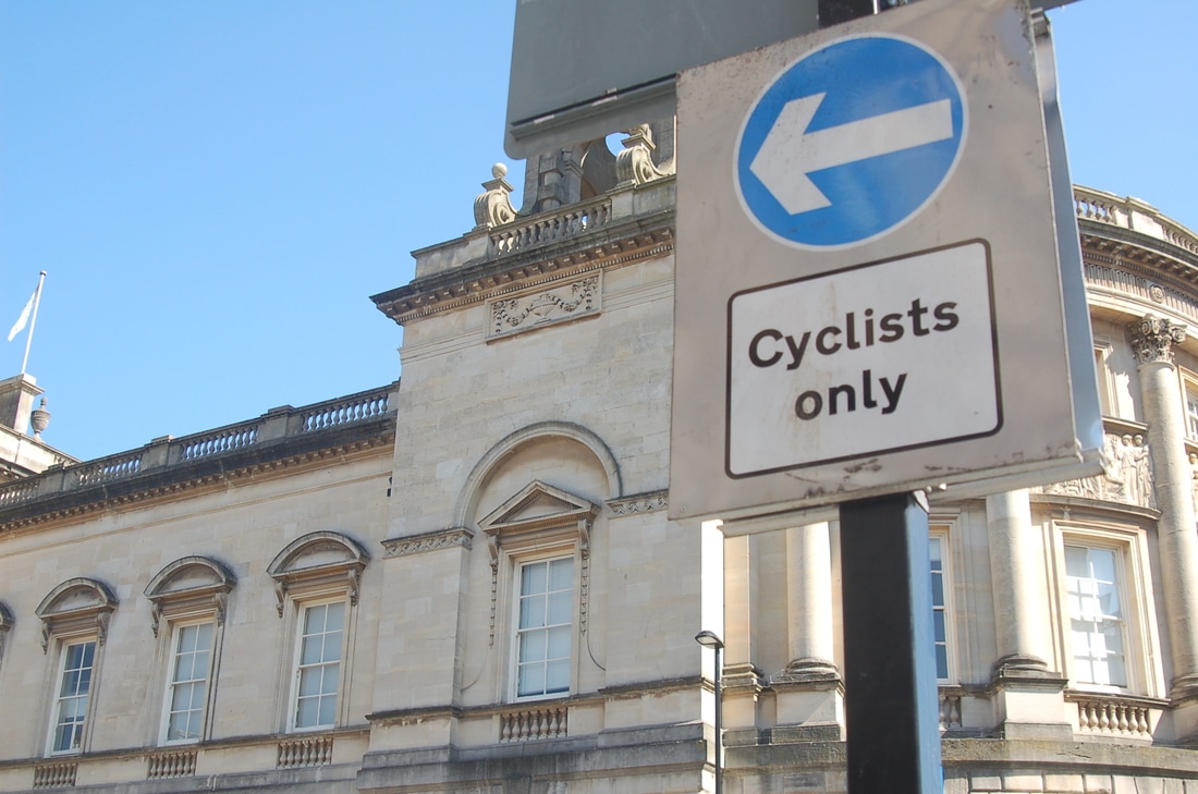
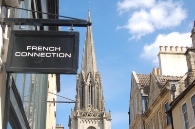
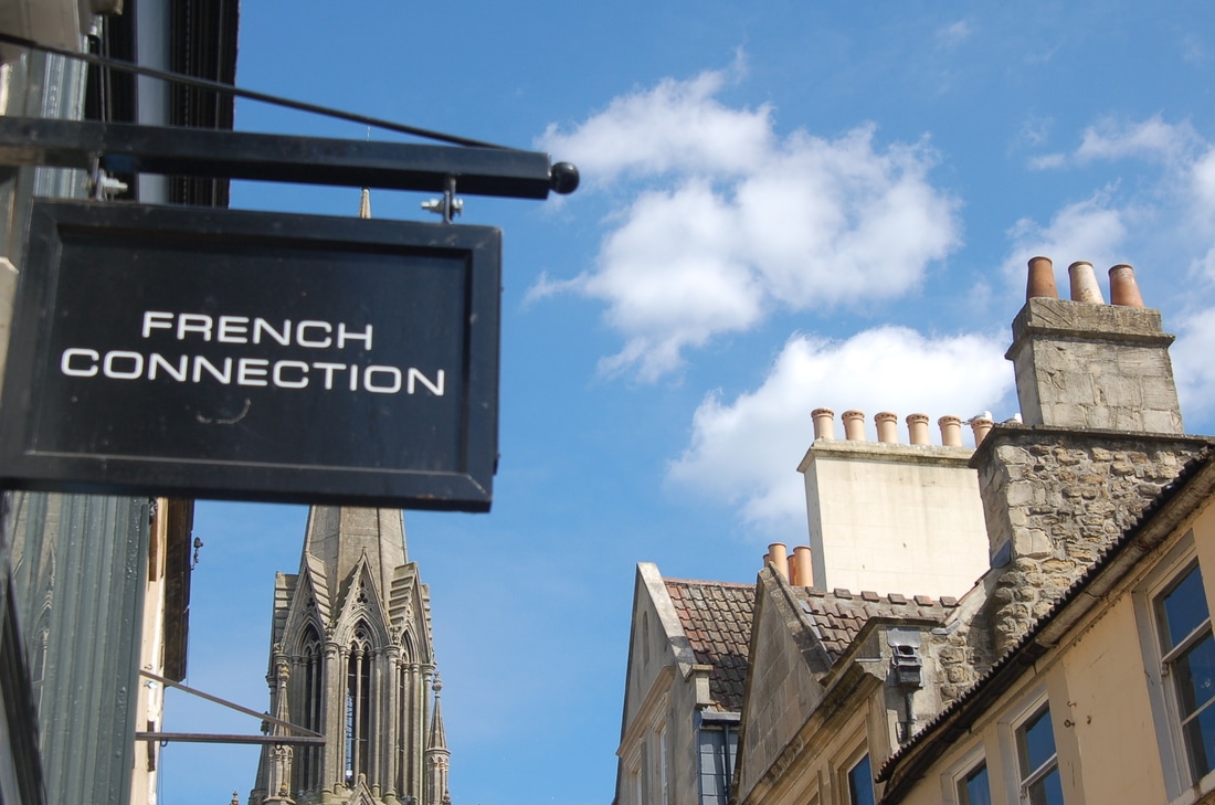
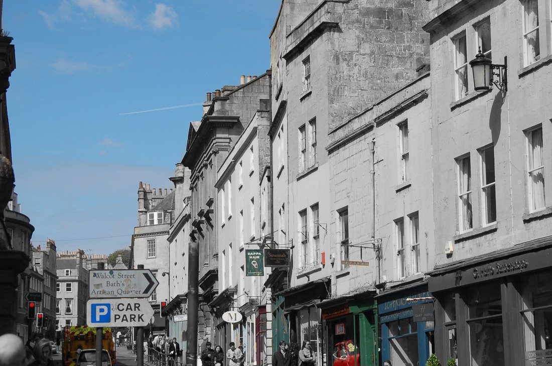
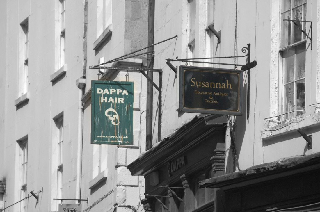
I could not decide on a particular photographer for my second photography idea to become part of my project as I could not find a certain photographer who specialized or who was particularly interested in taking photographs of road signs or signs of any sort. However, I became interested in this type of theme while I was taking photographs In Bath and noticed the amount of signs that you can find on just one street. From this I thought it would be a good idea to incorporate my first idea (Berenice Abbott) into my work. For example potentially having both buildings and architecture together with road signs as my main focus in the front of the photograph. I think this would be an interesting idea as you would be able to blur certain parts of the photograph and certain parts not so that some stands out more. I think taking photographs of signs and including it in my work will make the buildings stand out more and more memorable as it is clear where the photograph was taken. I also need to stick to the idea of having my photograph in black and white so that it is clear that it is still linked to Berenice Abbott.

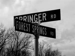
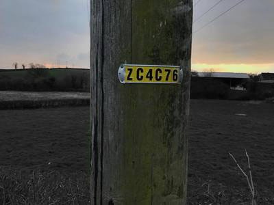
In the photographs above they all have a lot in common even though they were all taken by different photographers. The photograph I have chosen to critically analyse is the "Forest Springs" photograph. I chose to analyse this photograph in particular because I can relate it most to the work I am hoping to achieve. I could not find the photographer of this piece of work or the name but I think it would have been called "Forest Springs" due to the name in the photograph. In this photograph it is clear that it is quite a simplistic piece of work. There is only one prominent object which is the pole with the signs on however you can see a few trees in the background however the trees do not catch your eye as you are looking at the photograph. What does catch your eye immediately is the sign. I think this is because it is central in the photograph and is also the largest object in the whole photograph, so the sign is the main focal point. I think the content of this photograph could be linked to people even though there are no people in the photograph. I think the sign represents a choice, and being able to go one way or another/choosing a path. I think this way because there are two roads you can go down; Springer or Forest Springs. I think this is interesting that there are no people because you never which road people go down most often. There are some formal elements in this work, for example shape which is not very curvaceous and is more rectangular and symmetrical. Also lines which are quite thick and prominent for the signs which is why I think they stand out so much. There is also a lot of space in the photograph because there is so little to look at. This makes it quite a shallow photograph. There is a very dull and dark colour also due to it being black and white. This can be related to my first photographer Berenice Abbott as her work seems very dark and mysterious due to her using black and white for her photographs as well.
Shoot one
Plan : For these photographs I would like to take photographs of only road signs and nothing else. This is because I want it to look a lot like the photograph I critically analysed above. To do this I need to try and do certain things to make it look a lot like the "Forest Springs" photograph. One thing I need to remember while taking this photograph is to keep it simple. This is because in the photograph of the road sign above there was very little in the photograph other than the main focus (the sign) and a few trees. To do this I will look at the environment around me and make sure it is very simplistic. I will also need to make sure there are no people walking by as there are no people in the "Forest Springs" photograph. A very important thing to do is keep the photograph black and white so that it fits with both my first photography theme and also my second. Also the sign will need to be very prominent in the photograph like the road sign I critically analysed and also close to the camera.
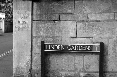
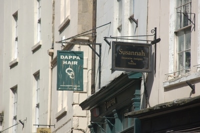
This is my first shoot for my second photography work. I think the signs I found were interesting as they were quite prominent due to the black colour. These were taken near Bath in Weston. I decided to edit in black and white to show that it was still inspired by Berenice Abbott even though she is not my second photographer. I think what went well about this piece of work is that I managed to make the signs the main focus of the photograph and also experimented taking the photographs at different angles. To improve this piece of work I need to now link the the first and second photography ideas together. To do this I need to find signs that are based around architecture pieces.
Shoot 2
Plan : Like before, I will be trying to incorporate signs into my work along with my first theme which was building and old architecture. For this shoot I will be properly going into Bath where all the shops and cafes are. My idea is to create a scene where there are old buildings alongside new ideas like shops and cafe signs. I think it will be interesting to see what par of the photograph stands out and what parts start to blend in. My plan for this is to still keep it very simple like I have in previous shoots because I feel if it gets too overcrowded the person looking at the photograph can tend to lose focus and look at the wrong part of the photograph as it gets too busy. Because I have never done this type of shoot before, I would like to experiment with different angles and shapes (circular, square) and see what captures my interest the most. I need to be careful with what type of buildings I choose in my photographs as well because this could cause the photograph to get too busy as well. One thing that may influence the look of the photograph is lighting. This could be an issue because if it is too light or dark it could change the whole look of the photograph.

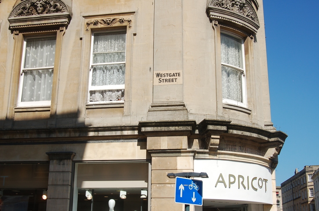

I really like these photographs and I think they loo very vibrant and bright to look at. I think this is partly to do with the natural light from the sun which shines onto certain parts of the buildings creating shadowy effects. When taking the photographs I tried to make the sign stand out a lot more than the buildings. I found this more difficult to do then I thought it would be. This is because the buildings are so large so instantly become quite a big part of the photograph. Also many of the signs were not brightly coloured so did not naturally catch peoples eyes.
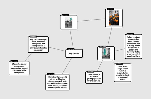
Pop Colour
Colour pop photography is one way of making your photographs stand out and look unique, especially when there is one object in the photograph you want to stand out. This is done by getting the photograph you want to use and making the whole thing black and white. Before hand you need to decide what part of the photograph you want to stay coloured. You then Duplicate the layer and brush over the part you want to become coloured. I am going to use this is in my own work to create a detailed photograph and make it unique. I like this idea of using different colours and shades in my photograph as I have control over what part stands out and what parts blend in more. For this I will often be trying to cause the building to blend more into the background and cause smaller details like shop windows and plants to stand out more. I think this will be interesting to see whether it works and and whether it causes people to look more at the smaller object and details rather than the large object which is very prominent like the buildings in my photographs.
Experimental Shoot
For this I tried to add brighter colours into my photographs and then do pop colouring. Even though this was my first attempt I feel as though I did well on Photoshop and figuring out the best way to make it work. Even though I really like these photographs, for my next shoot I am going to try and find more brightly coloured objects and also try and introduce back buildings into my work to make it fit Berenice Abbott a lot more.
Shoot 4
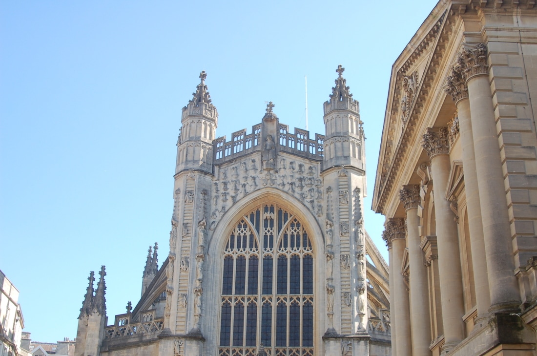
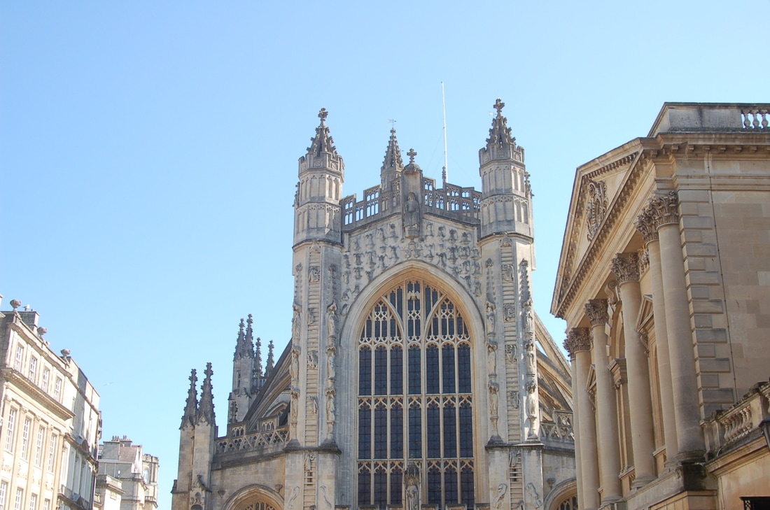
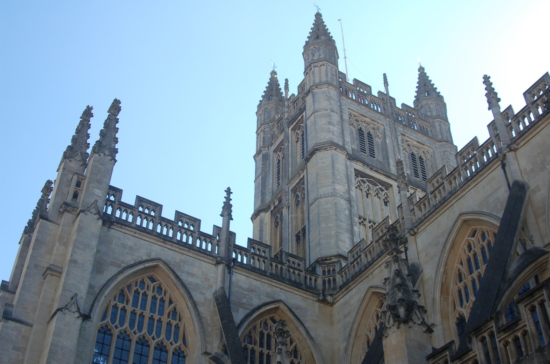
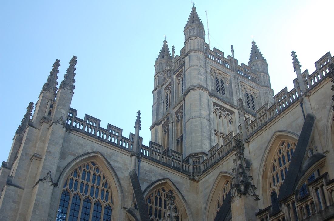
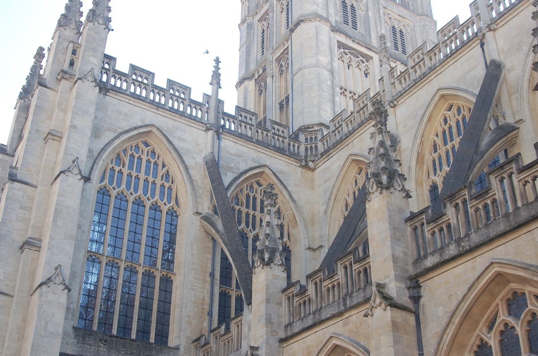
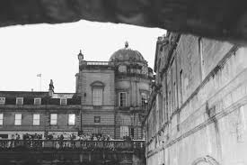
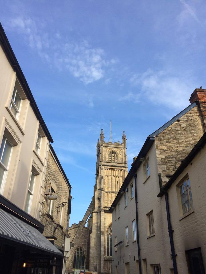
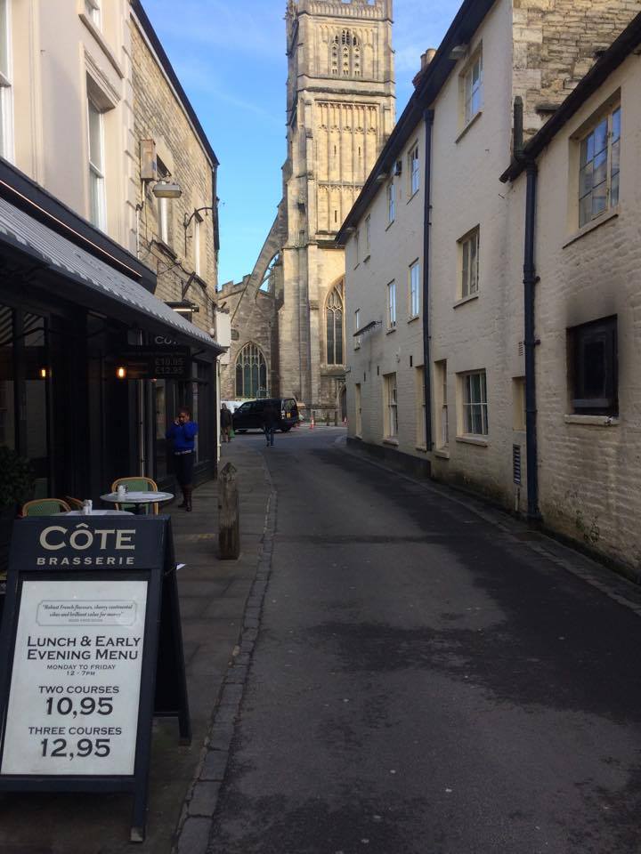
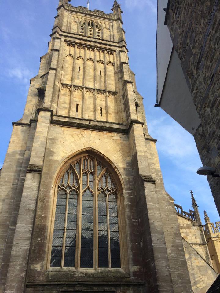
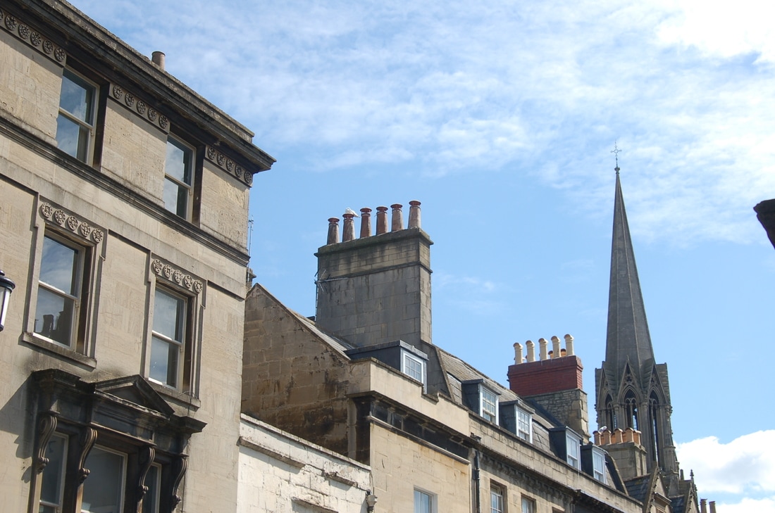
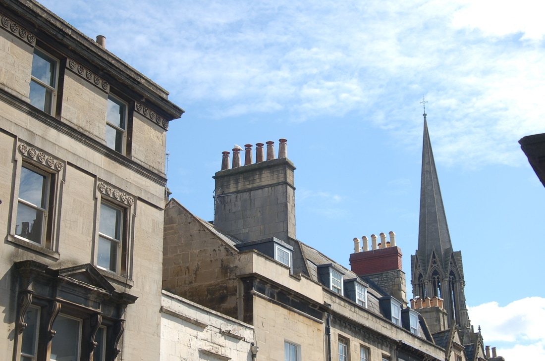
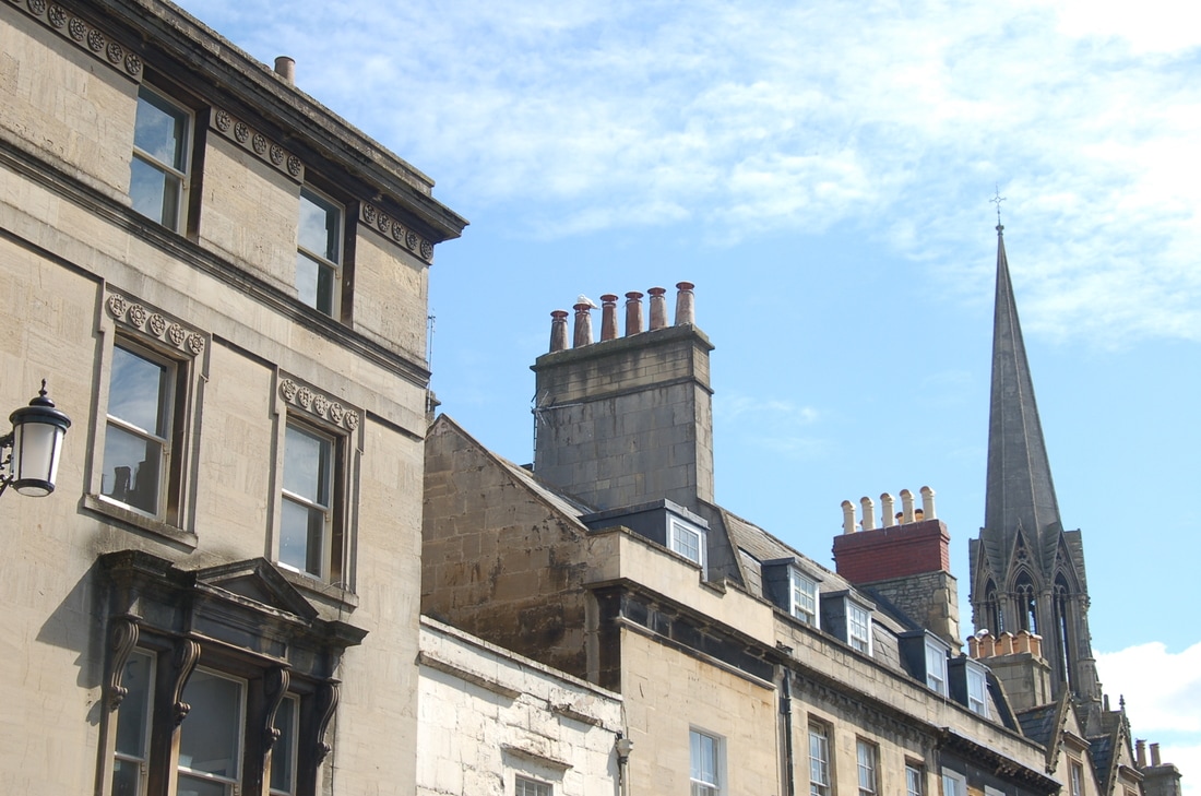
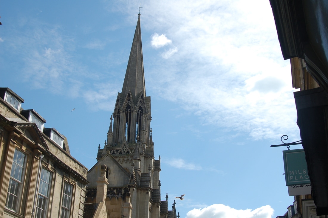
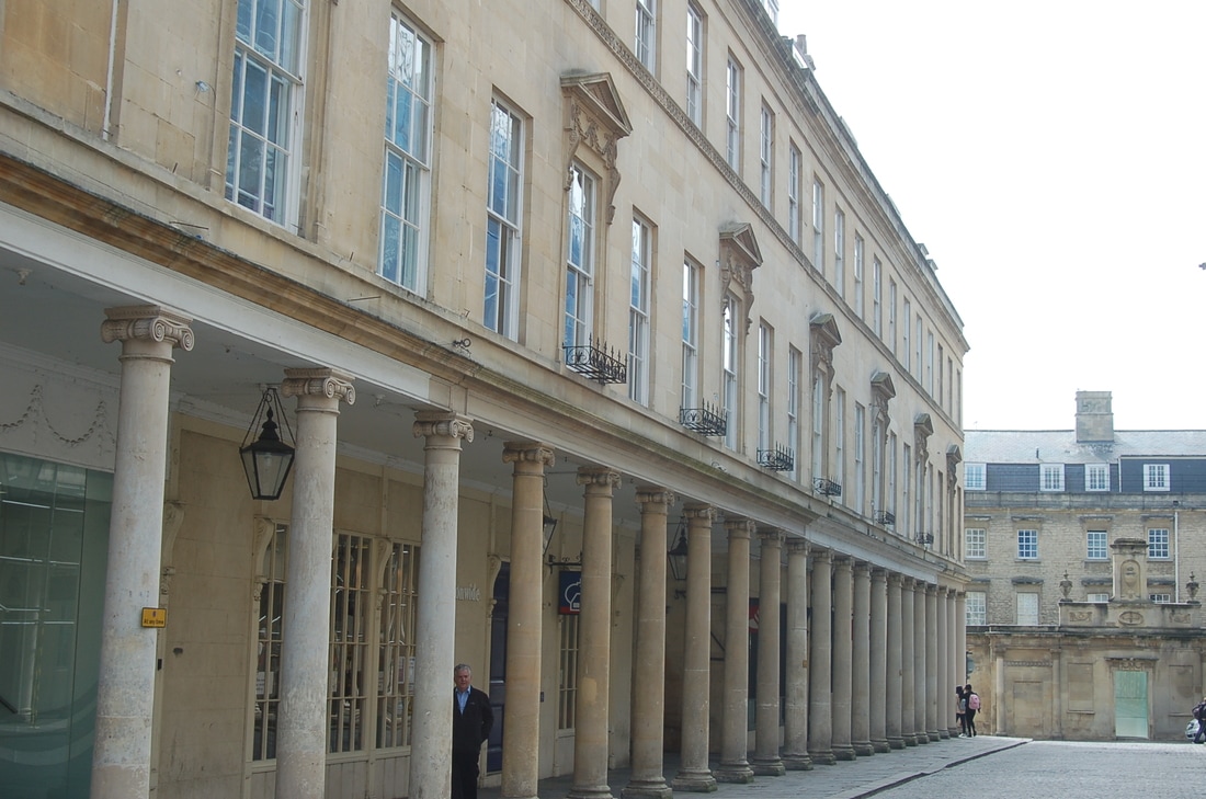
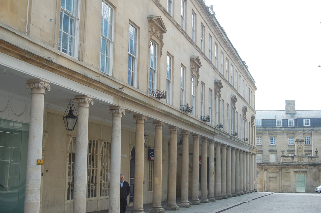
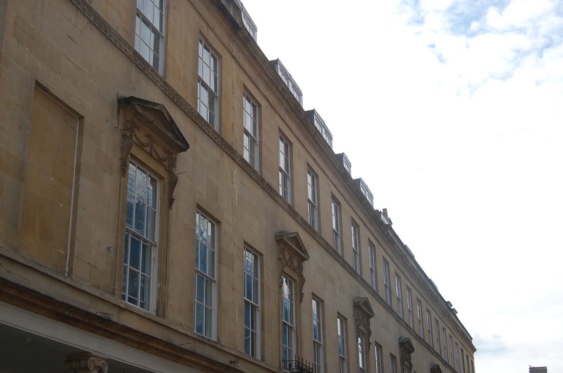
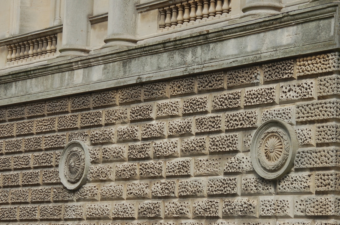
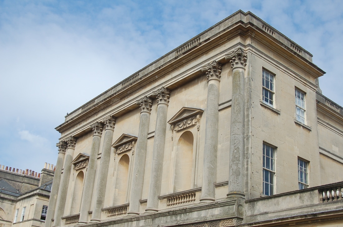
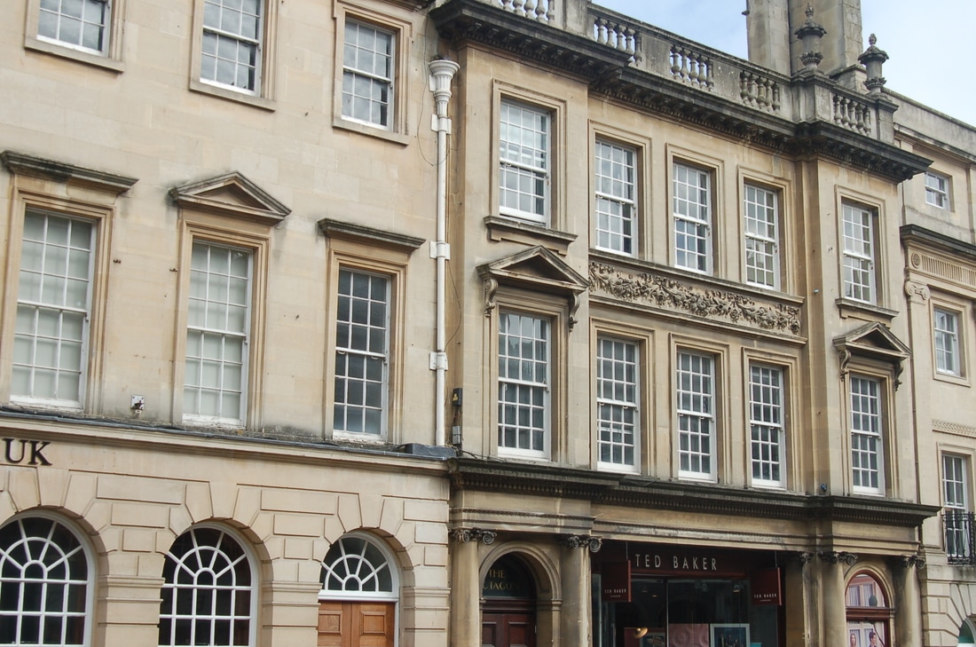
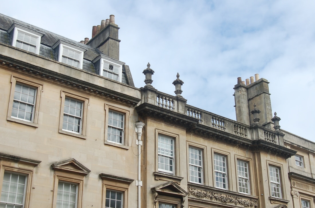
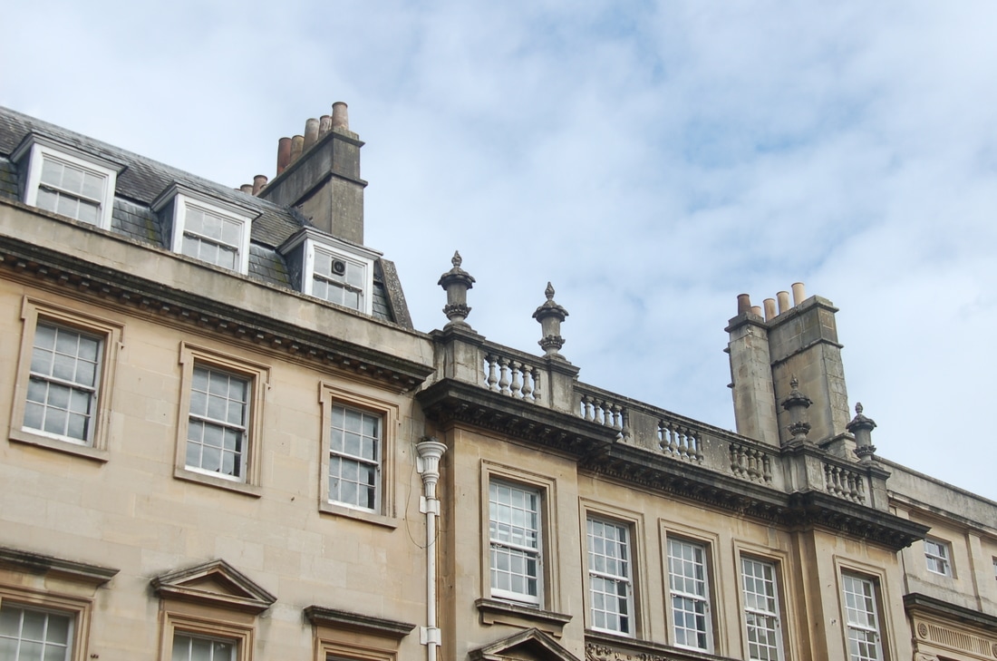
These photographs were taken in Bath. My idea while taking these photographs were to incorporate Berenice Abbott's work more into my work. Above mind map of a certain photograph taken by Berenice Abbott which shows various buildings overlapping. When I saw this architectural building in Bath I pictured the Berenice Abbott photograph I had analysed for my own work. In these photographs I took the building from various different angles truly capture how overlapping the building is. This can be seen by the decorative features which overlap the buildings walls. In this photograph, I could also see that it was a balcony where you could stand on top which also helped to capture the overlapping. In photograph 1, I have overlapped two separate buildings however in the bottom buildings the building is overlapping itself. In the first photograph there are three buildings, I find this photograph interesting as the building structures are so different to each other. I also feel like the blue sky and natural light help to illustrate the decorative features of the building. The shadows also turn the building into a shadowed effect on itself. To improve this piece of work i would have liked to have got closer photographs of the decorative and intricacy of the photographs.
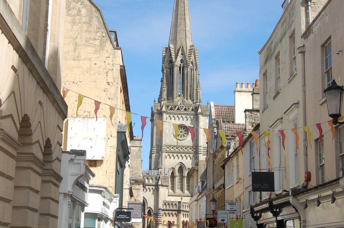
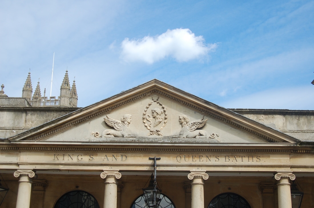
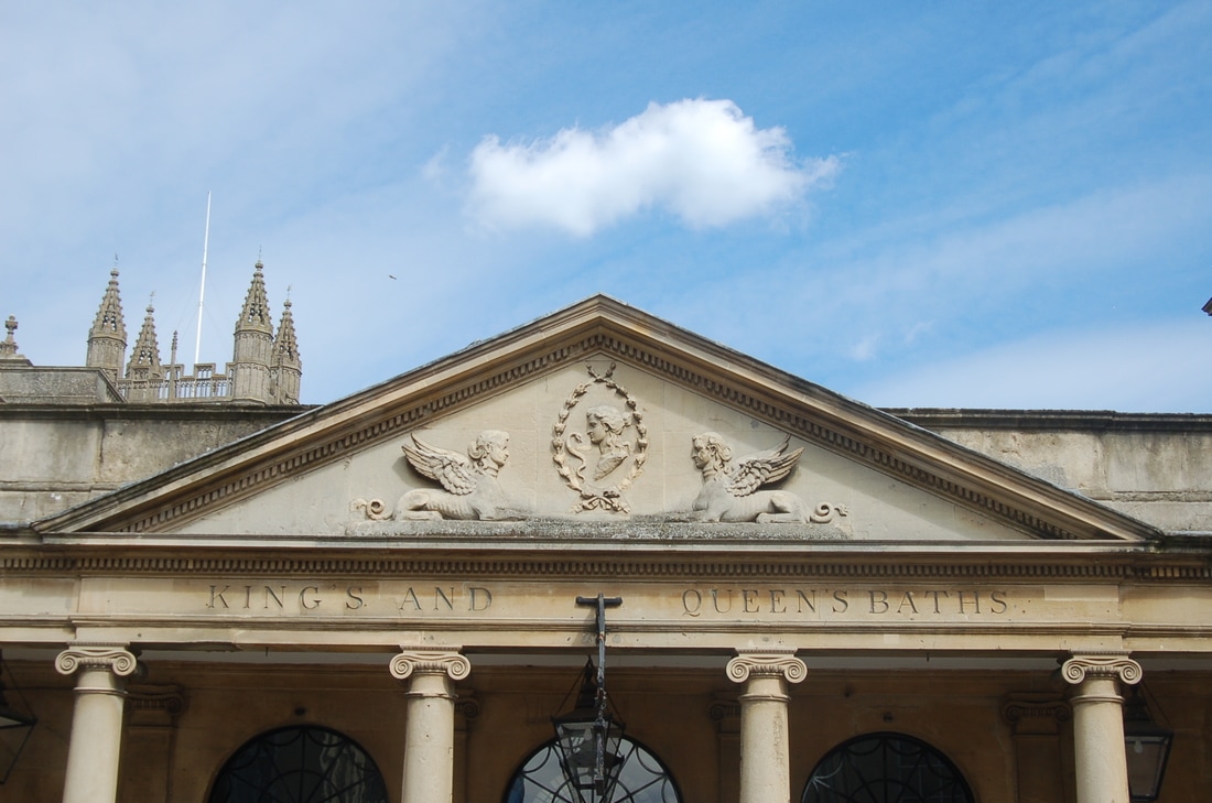
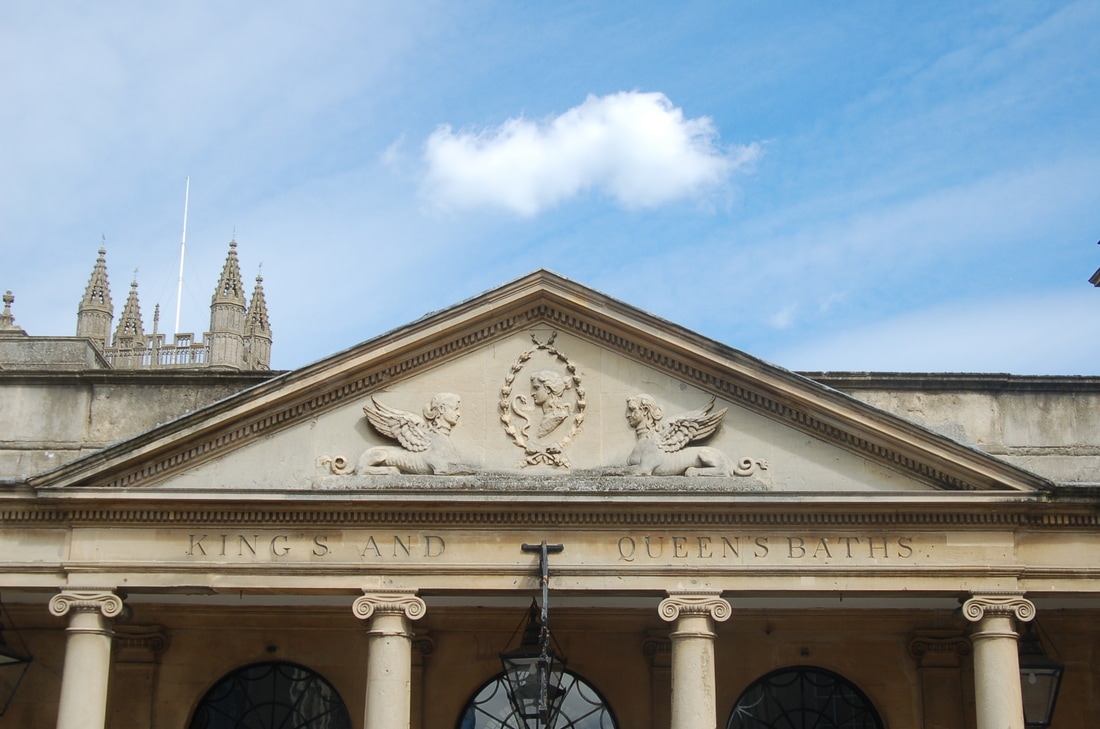
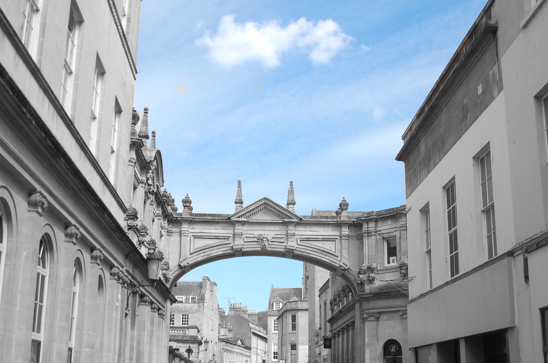
From the photographs I took in Bath, I decided I like the photograph above the most. I think this photograph relates most to Berenice Abbott due to the overlapping of buildings. This is a very big cathedral like building in Bath. In this photograph I felt the intricacy and detail shown of the buildings patterns on the walls and windows makes the whole building stand out. I think people looking at this photograph would be interested to look at this due to the amount of detail. I decided to do pop on this photograph. I did this by going on Photoshop and duplicating the photograph layer. I then made the photograph black and white and painted over the parts of the photograph I wanted in colour. This is so that when there is a photograph where there is a very bright colour like the one in my final piece, you are able to see clearly the contrast between black and white and colour. I did pop colour for the photograph above even though there was not a particular object which had a very in your face colour. Instead I decided to keep the building in black and white and keep the sky a blue colour. I think this turned out very well as it made the blue colour stand out a lot up against the grey colour of the building which was not there before. My next steps are to do more pop colour pieces with future shoots and still remember to keep my photographs inspired by Berenice Abbott. I feel my photographs can still be linked to Berenice Abbott, especially the photographs above. I think this because of the angle I have learnt to take the photographs at and the black and white filter I use.
Shoot 4


Pop colour
Final Piece
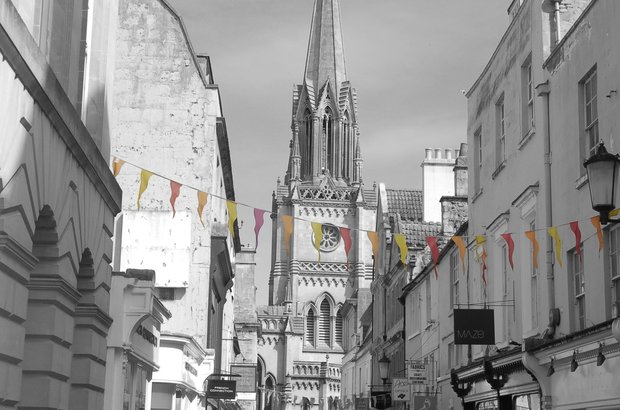
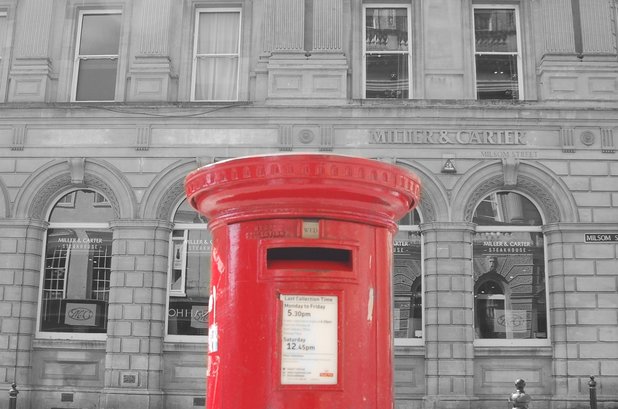
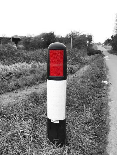
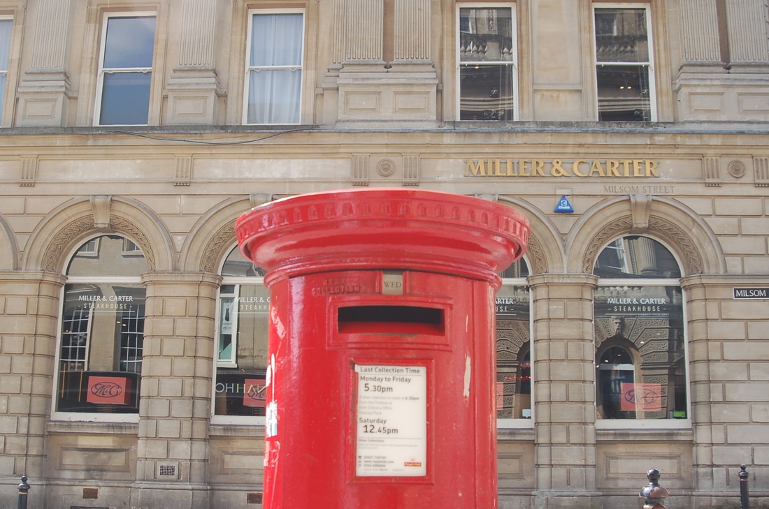
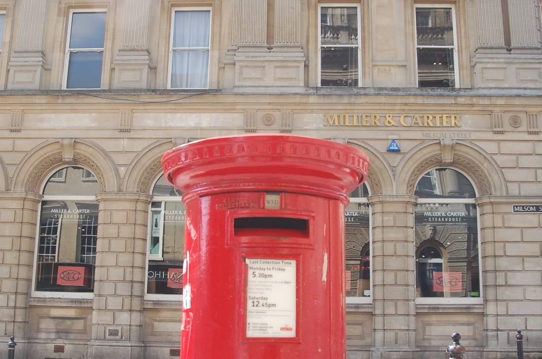
Evaluation : This is my final piece consisting of 3 photographs. I chose these 3 as I felt they fitted together nicely and worked well together. They were all taken In Bath and all use pop colour to make certain parts of the photograph stand out. For the first photograph, the only coloured part is the bunting. I thought this was a really nice idea to keep everything but the bunting in black and white. This created a really nice contrast and also made the buntings bright colours stand out and form the photograph. In photograph 2 I decided to take an image of a post box. I thought this would be a really nice photograph because of the post box red colour. For the third photograph I coloured the signs from shops as they were brightly coloured however everything else (but the sky) was left in black and white. I feel as though these photographs went really well and was best photographs in this project that I have taken. I feel my work has improved during this project and I have developed ideas from different photographers to help build my work even further.
